
Smart Home
Reinventing daily electricity consumption experience
@EDF Pulse / 2021
User Research
3D Prototyping
UX/UI
kWh, Watt, Amh, Volt... Over the past few years, people have become increasingly familiar with energy-related data. With the development of smart home technologies, people are increasingly interested in understanding the complexity of information related to their daily energy consumption, data which has long been hidden behind an electric meter.
Process
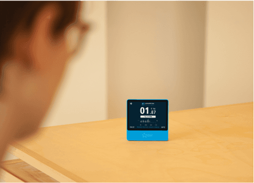
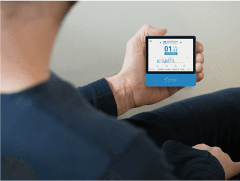
As part of frugal innovation research at Design Lab, I worked on a project to deliver a real-time energy monitor to energy-insecure consumers who struggle to pay their monthly bills or effectively manage their savings plans. As the product design lead, I focused on the typical life patterns of these customers in order to create a user-friendly and dignified interaction with the interface.

I conducted visual research based on the limitations of display performance.


I conducted behaviour tests using prototypes and 3D models.
Ideation
The first version was produced to meet the screen size requirements outlined in the decree addressing fuel poverty. The small display for home use needed to inform energy-insecure users about their consumption patterns and notify them of any anomalies. I conducted user tests to ensure the information was readable enough and to gauge the users' level of understanding regarding the different energy data.

I developed an interaction concept for mobile app.
In addition to the home display that meets government requirements, a mobile app has been envisioned for future implementation. The app integrates additional features to encourage more engaged user interaction.
I worked with my team to gather insights by interviewing users from different generations and understanding their projected needs in line with the evolving way of life in the future. Then, I led a workshop with other designers to generate a series of prospective energy UX concepts.
I also led the entire execution phase by creating mockups, frameworks, motion samples, and initial prototypes to guide the decision-making process. The first example shown below explores the relationship between power (watt) and consumption (kWh). These interactive mocks have been used for usability testing and continuous design specification updates.
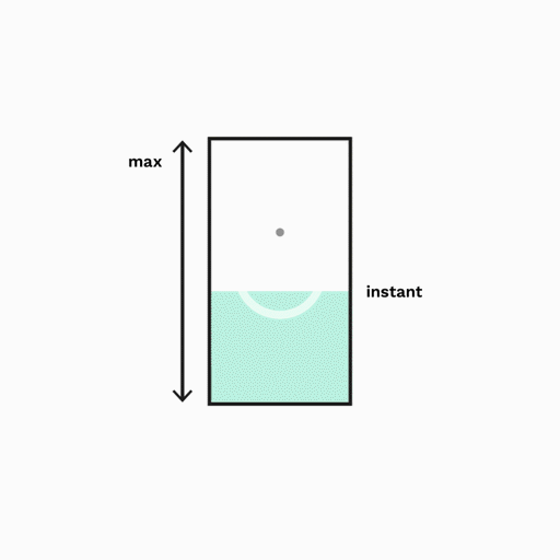
The watt power is represented by the speed of rotation, drawing an analogy to the traditional electric meter movement. Following the simple logic of accumulation, the real movement generates the kWh, which fills the gauge representing the maximum daily consumption.

Using a bar graph approach, the accumulation of daily consumption provides a vertical record that can be scrolled up and down for easy interpretation of instant consumption levels based on the height of the bar units. The screen height serves as a visual cue for the maximum level.

To compare consumption levels with the past week, a simple swipe reveals another bar graph that instantly scales to the appropriate range.